
I designed the largest addition Tidepool made to the open-source Loop app: onboarding and in-app training that enabled new users to train at their own pace on their own devices while still ensuring safety in all critical tasks.
Challenge:
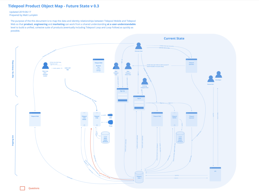
Onboarding: from 0 to 1
By building on an open source project with no in-app onboarding or training, we knew that one of the greatest opportunities to add to the DIY app was in enabling people to onboard new users safely and quickly. Further, we needed the onboarding to be complete prior to our Human Factors testing because it was our primary means of supporting new users and would be a key area of inquiry in our FDA 510k submission. It also needed to integrate third-party partner device training, setup and pairing, including their previously validated training content modified only where our UX differed.
The Pump-Start Paradigm
The current state of insulin pump onboarding is almost exclusively through in-person trainings usually over 2-3 hours with a manufacturer-paid pump trainer. This in-person, high-touch approach is both costly to device makers and burdensome to many people with diabetes and caregivers because it involves taking time off from work, and travel and doesn’t often adapt well to different learning styles. That said, it’s hard to replace the safety benefits that come from in-person observation that the user is using the interface correctly. When that interface moves to software, the human factors validation becomes that much more important.
Controller Software:
an opportunity for interoperability
The opportunity for Tidepool Loop exclusively playing the role of the controller software (and not the CGM or Insulin Pump), is that we had an opportunity to define a new onboarding experience for a digital therapeutic that, while coordinating the activity of connected devices, was in fact only exclusively software. Our goals were to use this onboarding to:
- increase access to more people with diabetes by minimizing time cost
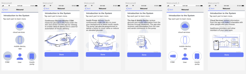
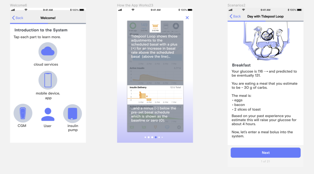
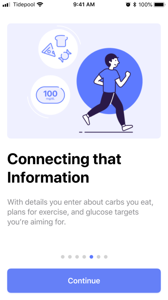
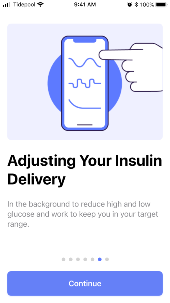
- provide digital delivery of training in-context, on the device they would be using
- be flexible and modular enough to enable the addition of new pumps and CGM’s as needed without breaking what came before
…all while ensuring that it trained them to safely use the system for delivering insulin, a hormone that, if dosed incorrectly can be fatal within minutes.
For regulatory geeks: Tidepool Loop is designed to function within the FDA's interoperable automated insulin delivery paradigm as the Controller software, designed to interface with other interoperable, "Alternate Control Enabled" insulin pumps and interoperable "iCGM's."
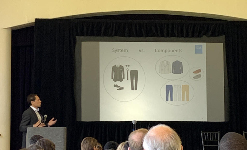
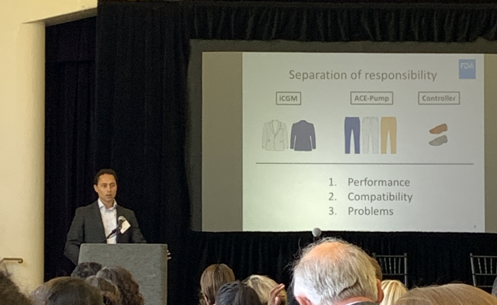
Alain Silk, FDA Branch Chief, explaining the agency’s vision for interoperability with a clothes metaphor in 2019.
Approach:
Phase 1: Mapping and Sketching
Identify Stakeholders and SME’s
We began by identifying and consulting with key subject matter experts:
- Open-source app users and
- Community training leaders
- Endocrinologists and Clinical Advisors
- Diabetes educators
Which Hat Are You Wearing?
It also became clear that many internal team members also had assumptions and ideas about what this onboarding would cover as many of them also live with type 1 diabetes and were open-source users. At first, it was difficult to determine whether folks were sharing input from their professional roles as developers and QA engineers or from their personal roles as diabetics or caregivers. I started modeling and requesting that, whenever it was ambiguous, we explicitly state which hat we were wearing when championing a given perspective or feature. This is a key user-centered design value I regularly champion: holding a clear boundary between our own experiences and that of our users. This is all the more critical when there is significant overlap.
From these early conversations, I drafted the formal Product Requirements Document for this feature set and guided it through several rounds of revision with the executive team, product, and engineering.
Information Architecture of Content
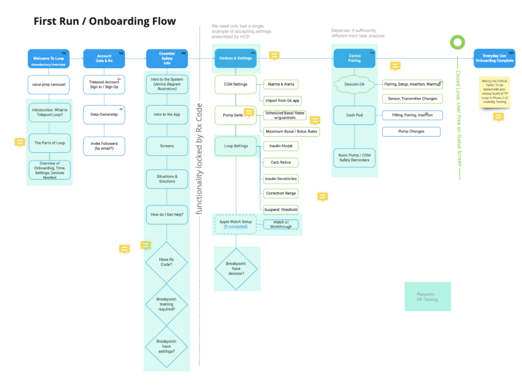
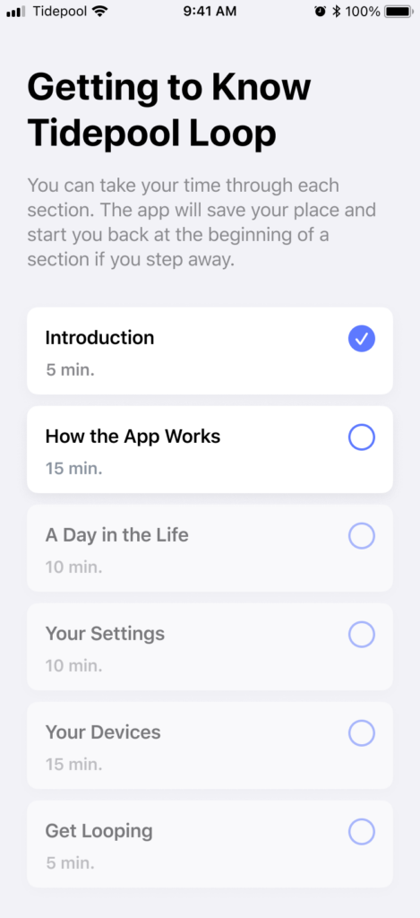
We developed an outline of the content and began mapping out the information architecture of what sequencing made the most sense. Our target was a setup time of half an hour or less if done sequentially.
It became clear that our onboarding needed to be significantly longer than most consumer-facing app onboardings (1-3 minutes) but significantly shorter than the current industry standard for insulin pumps (~3 hours).
So we started organizing the content in chapters that could serve as checkpoints to enable users to complete parts of it and return with their progress saved. Further, we wanted to enable new or potential users to learn about the app in detail before doing the work to get a prescription from their doctor. By moving the content lock to after account setup and detailed training, we preserved an important marketing funnel whereby the content itself could continue to make the value props of our complex product explicit and we could reach out to potential users who started to onboard but never completed prescription.
This clarified the need for back-end infrastructure to manage user prescriptions and gate access by them. At this point, I did some quick mapping of where this might fit with existing infrastructure and what new components might be needed. This map enabled me to have a clear shared understanding with our VP of Engineering and enabled the product and engineering teams to anticipate what features we would be needing and get them on the roadmap.
Wireframes and Storyboards
Along with my colleague, Paul Forgione, we then began wireframing out the onboarding experience. We wanted a simple to grasp, visual description of the system and how it fits into daily life so I started storyboarding illustrations for some of those components.
Live Stakeholder Review
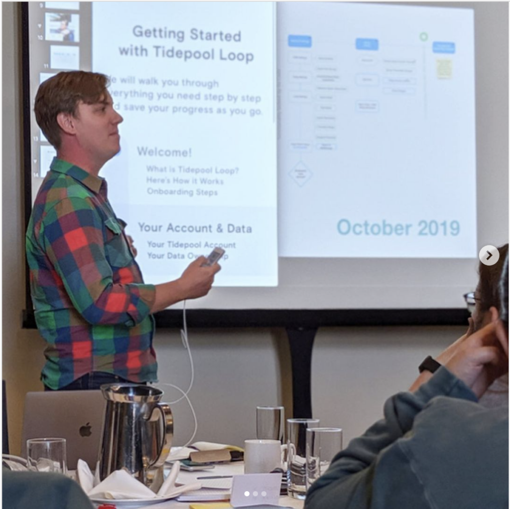
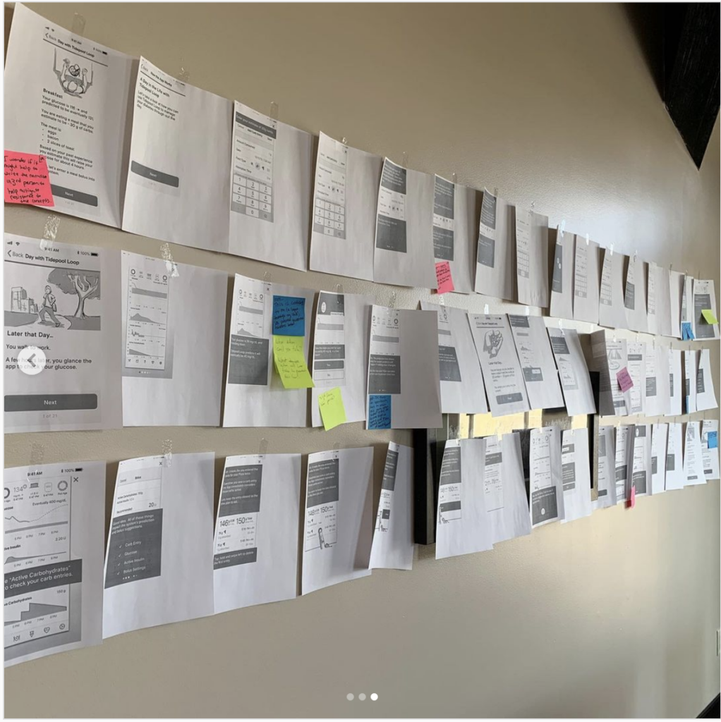
Our VP of product asked me to present the onboarding work thus far at our next in-person onside retreat. After walking through our process, feedback thus far and goals, We printed the 30-minute onboarding out and hung it up gallery-style inviting questions and feedback from the whole team. This not only resulted in lots of great input but generated a lot of clarity among the rest of the organization about where we were in the process and how their departments and teams could fit into the future we were designing for Tidepool Loop.
Phase 2: Refining, De-Risking, Branding & Testing
Instructions for Use
While we always envisioned the in-app onboarding as the primary source of safety training for new users, we were simultaneously developing a more comprehensive set of instructions for use. Our initial draft was based on and expanded from the content from the onboarding. But the process of writing instructions for each feature forced us to make and document clear decisions on consistency in language, labels, and even metaphors. In collaboration with the Marketing team’s lead writer, we began to create an authoritative glossary. From this, we were then able to document each use of keywords and terms we expected to be impacted by future updates so that we could track their occurrence in the app and gauge the lift of seemingly small terminology or label changes.
Use Related Risk Analysis
Even though Tidepool Loop was still under development, we had a unique opportunity to learn from known risks in the open-source app. DIY Loop, as we called it internally, had been in use for several years and had a thriving online community in a Facebook group devoted to troubleshooting and support. In collaboration with the product team, I designed and ran a study with two major inputs:
- A survey of the Looped User Group requesting reports of known use errors or risks.
- A sample of one month of posts taken from the Loop users’ Facebook group
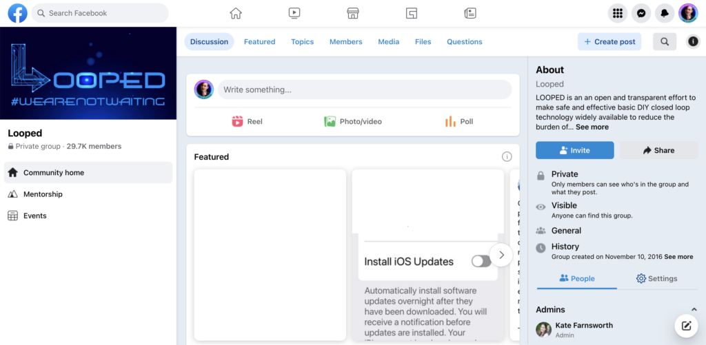
We requested permission from the leadership of the group before conducting any research. They granted permission provided we shared the results of our findings. They, like many other disability communities, have learned the all-too-common pattern of designers and researchers extracting value and expertise from their community without sharing any of the learnings or insights back. We wanted to honor their work by sharing the knowledge we built from it.
We wanted to honor their work by sharing the knowledge we built from it back to the community.
Collecting Facebook post data from a Facebook group without violating the terms of use of Facebook by using any scripting or automation is a tedious and non-trivially technical task. Facebook is not designed to load that many posts in a single view without crashing and it tended to crash mid-scroll. I literally had to set up the computer running my browser in a particular way to enable more ram allocation to Chrome and use a custom search query.
The number of posts in one month was on the scale of 10’s of thousands. I saved a total of about 600 that were potential use-related risks. I then carefully read through each, tagging and categorizing them as I went, developing a schema of level of risk and root cause in perception, cognition or action. After applying the same analysis to the survey results we ended up with approximately 117 use-related risks.
This research served as the foundation for an interdisciplinary risk-management team made up of clinical advisors, product, engineering and QA documenting the risk assessment for each and how we planned to mitigate each risk.
Many of the design revisions I worked on and highlighted in my Tidepool Loop Case Study came from the most critical risks. Knowing the real user stories behind these made a huge impact on being able to design mitigations for them quickly and effectively.
Branding
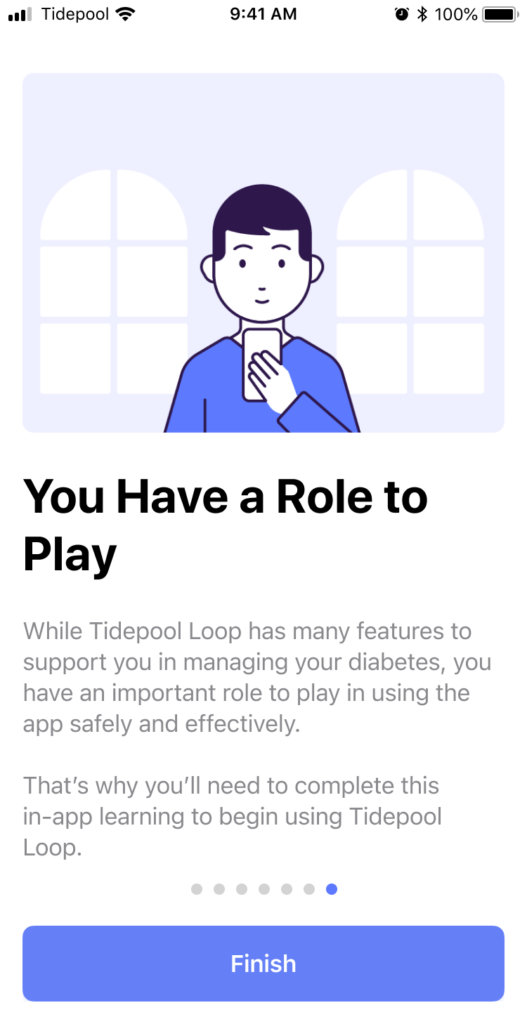
The product and marketing teams were simultaneously working on developing the brand of Tidepool Loop. While the design team had mostly been focused on the UX of the experience up until this point I did contribute to the decision on which agency to hire, their orientation to the existing products and brand, and to several key decisions for the visual design. We landed on a simple cartoony visual style lifted from Japanese subway signs. I lobbied that we should name our character Skippy. But I was unsuccessful beyond Design and Product. I was however pleased to see most of the layouts and visuals from my storyboards intact in the final illustrations. You can see them all in DIY Loop Onboarding.


Human Factors Testing
Finally, after another pass through the onboarding consistent brand colors, illustrations, and layout, we were ready to test whether our onboarding was sufficient to enable anyone with diabetes, regardless of prior use of CGM, pump, or iOS to use Tidepool Loop safely.
While our human factors testing process was dramatically impacted by the pandemic (see Remote Usability Testing), our study design was reliant on the in-app training as the primary source of training for all critical tasks identified by our risk management team.
We had study participants complete the in-app training as designed, wait 24 hours, and then complete critical tasks on an iPhone SE gen 2.
Results:
To our delight and relief, there were no misses on any high-risk tasks. And even when the study showed that users had cognitively misunderstood an aspect of what the app was showing or doing, their misunderstanding did not result in any unsafe actions on critical tasks.
Later, during our submission, the FDA reviewers specifically called out our HF testing methods and results as excellent.
Finally, and most impactfully for our ongoing work, the agency proposed no changes or refinements to our onboarding and in-app training.