
MY ROLES
-
user researcher & user advocate
-
designer of UX, UI
-
web developer: PHP, javascript, HTML, CSS
-
project manager & rotating stakeholder wrangler
Challenge:
To update an aging website mismatched with the library’s new, modern building with a modern CMS (WordPress) that enables
- easy updates and communication to patrons by non-technical library staff
- easy reference to library hours and policies
- a unified point of departure to a wide-ranging and ever-changing collection of external vendor-based services
Outcome:
Material Design Plus Material Architecture
Starting with a photo of the library’s newly updated campus with strong visual identity, I began to bring that visual identity into conversation with Google’s material design specification site. The library web team had highlighted material design as a positive expression of what they intended by “clean design.” Further, the library site was interested in having less visual continuity with the main institutional website so starting with the strong architectural visuals of the building itself was an easy point of departure.
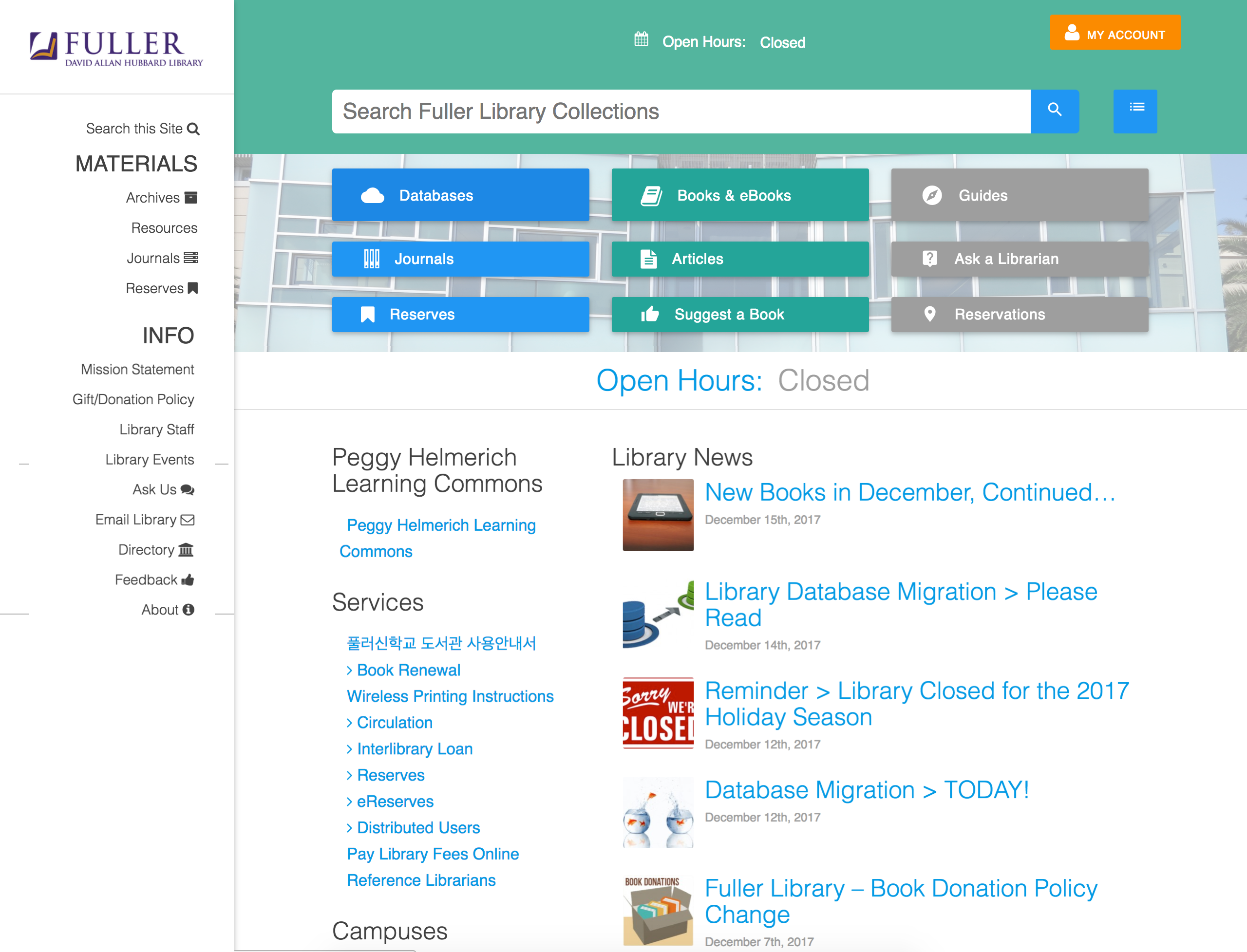
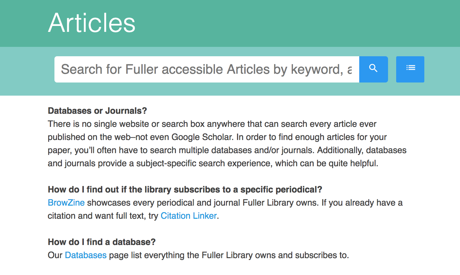
What Exactly Am I Searching?
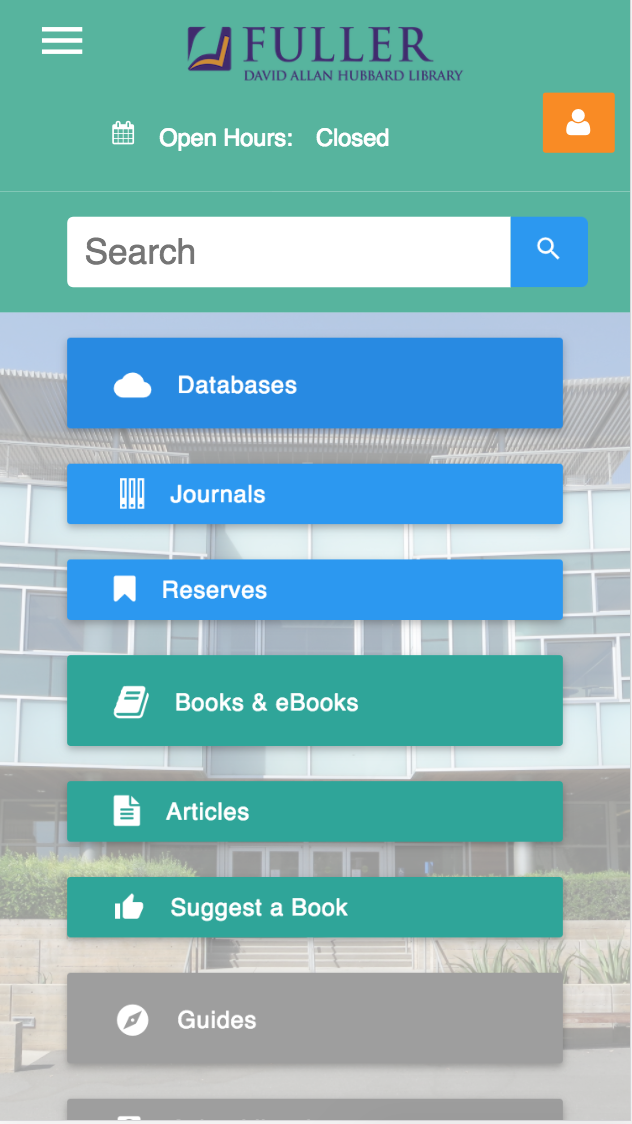
The preliminary user survey and research revealed that there was considerable confusion of what the boundaries were on any given search initiated from the old website. Were they searching books or periodicals? Databases or policy? This is a common problem faced by library websites who often serve as a sort of power-strip to plug in various services and appliances. Many rely on tabbed search boxes but these performed poorly in face to face user-tests with library patrons. The first, default tab was often the only one engaged.
Instead, I went with a user-centred approach based not the top tasks listed by the respondents to the survey: to find articles, books, and ebooks. Though the catalog vendor does allow filtering of search results after a global search many users never find this. So rather than folding all the search boxes into tabs, we instead made one search box per page and many pages focused on particular searches. To make more clear what any given search boxes were searching, I added tool-tips on hover to make explicit where the search was going and what boundaries were on it.
Some user approaches to searches are persistent despite being ill advised. For example, not all periodical articles are indexed by the main catalog, so a search there may or may not discover whether that article is available through one of the library’s database subscriptions. But this approach enabled us to still work with the persistent user interest in a less than optimum strategy and use it as a teachable moment.
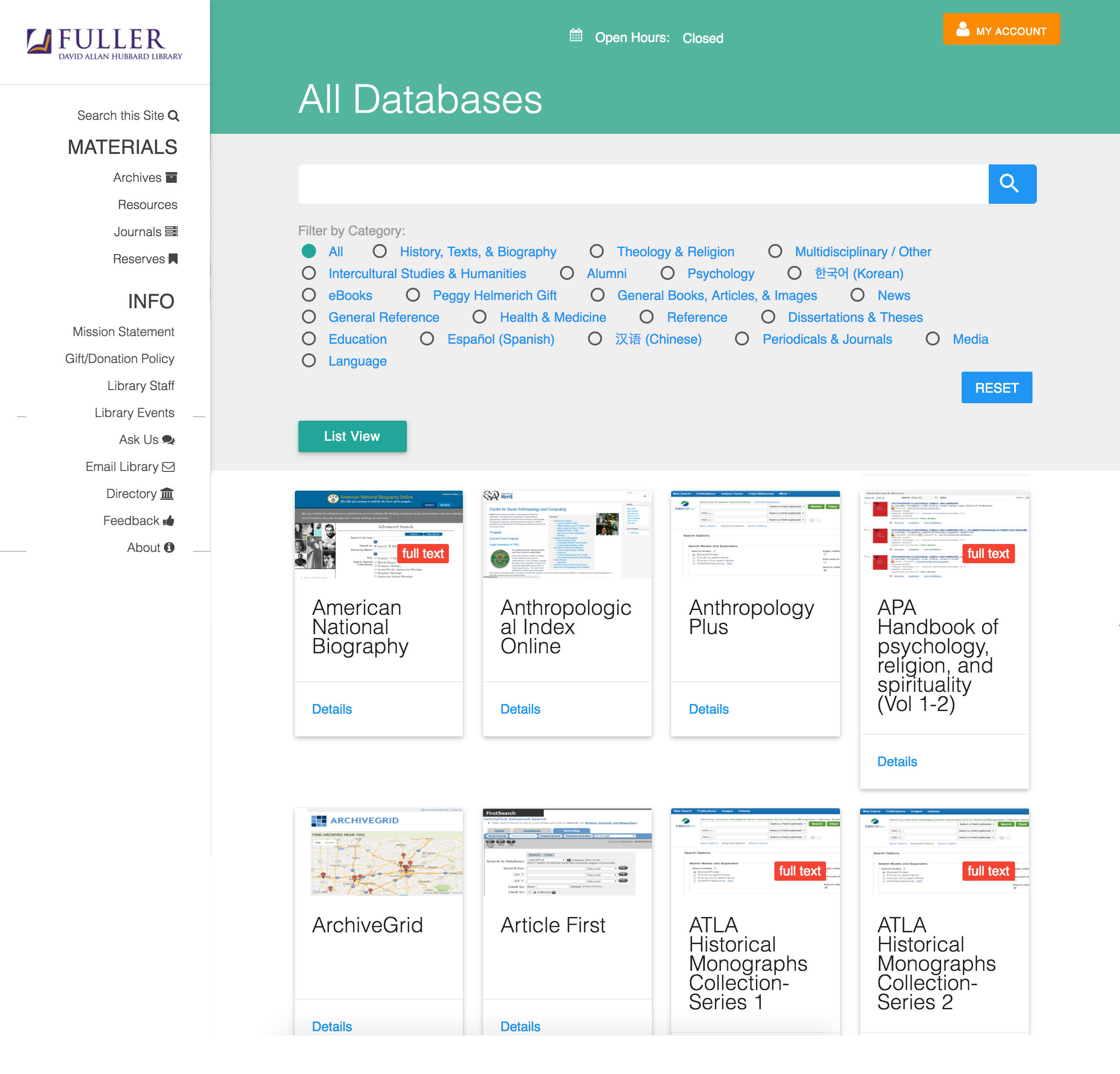
Managing Databases, a Visual Approach
The top priority activity on the site for all user types (students at masters and PhD level as well as faculty) is to access remote database subscriptions. These are bundles of periodicals, books and collections made available to students by library subscription. There are many that never change but also a good number that rotate in an out. Access is managed for on-campus users by clicking through the library link and matching an IP range. For off-campus users they need to sign-in to create a session. In either case their journey must begin with the library site.
Yet in the old site, the list was over a hundred blue hyper-links in small text on a white page. Further the link to the database must include a variable to route the user through the proxy login process.
I designed a custom post type in WordPress that enabled the library staff to add and remove databases as our subscriptions changed and to tag them with critical information such as whether or not they are full-text.
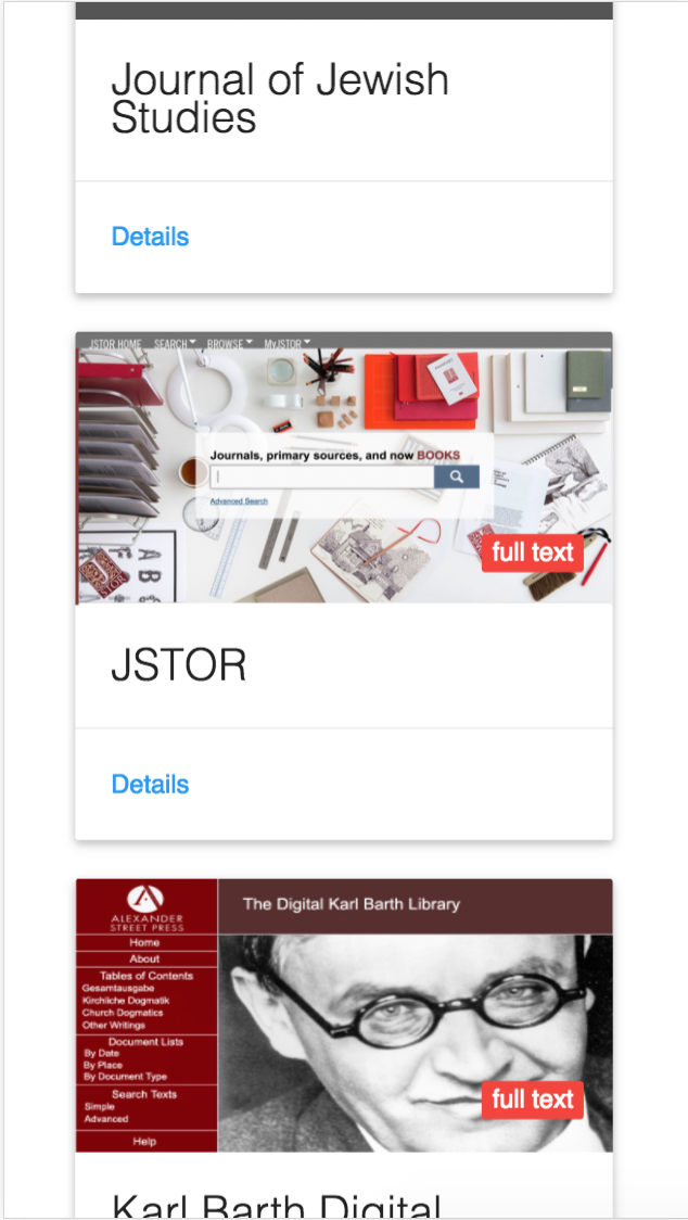
More importantly, I designed a page listing that enabled filtering by category, instant search by name and even included a visual cue to the user of what the database they were trying to find looked like. This enabled visual confirmation of their intended destination and served to prepare them for leaving the site.
Early user feedback showed that while the majority enjoyed the visual card view, a vocal minority found it too busy and confusing. They just wanted their list back. Fortunately, WP-Toolset made building an alternate view from the same database call trivially easy, so I added a “List View” button that re-renders the call.