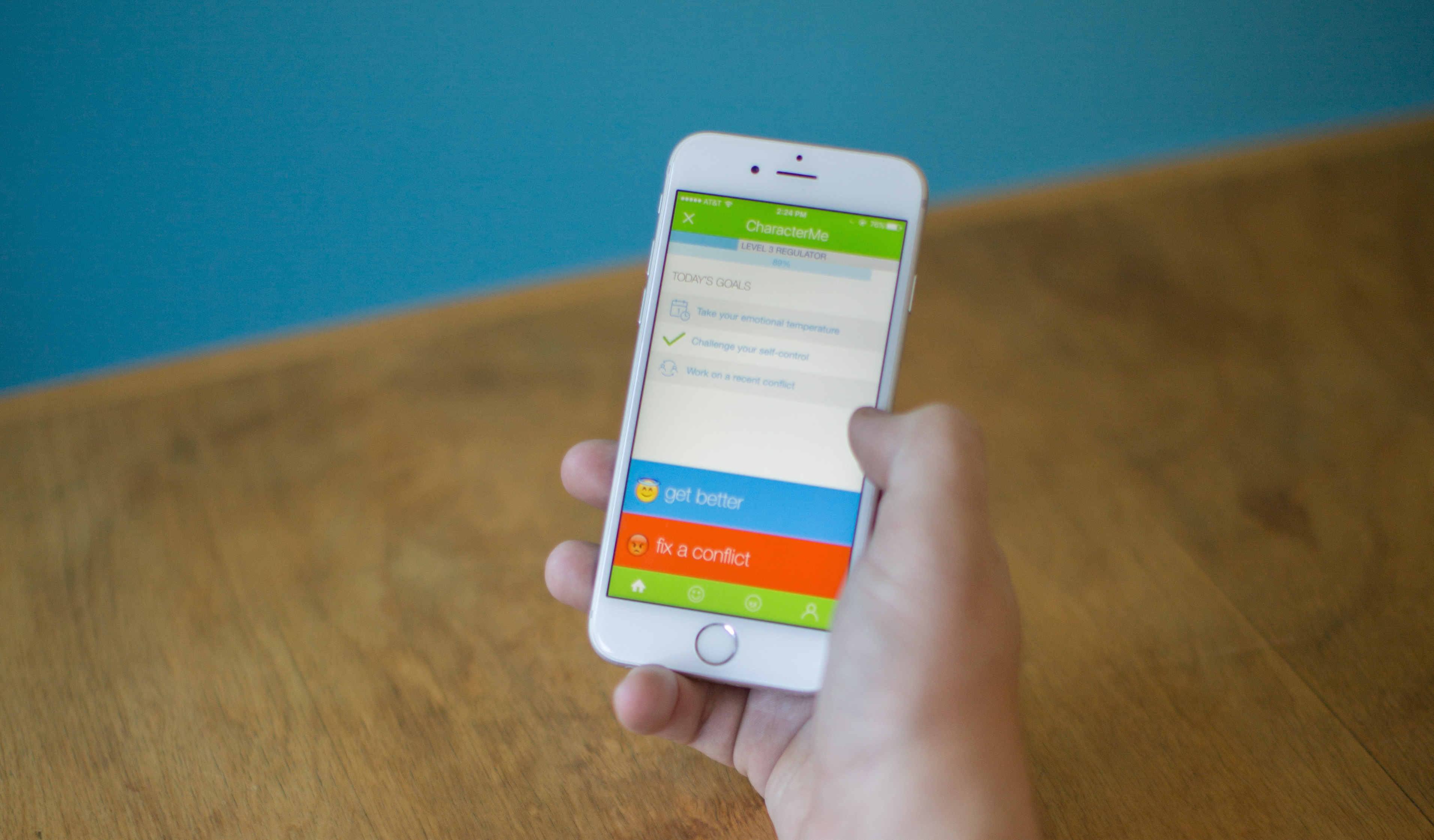
CharacterMe is a brain training app designed to help teens build patience, self-control, emotional awareness and better conflict resolution.
Based on interventions from the best of positive psychology, we designed and built an app to both deliver interventions and test their effectiveness over the course of a two week use period.
Since deployment to the iOS and Google Play stores we’ve tested it with over four hundred students drawn from the Los Angeles area, from a wide variety of socioeconomic educational backgrounds.
Challenge:
Design a mobile app that tests the effectiveness of character growth interventions on teens
–but keep it fun enough so that they will want to use it.
The first challenge in this project was to make use of the rich body of positive psychology research evidence suggesting the value of certain actions and practices for emotional health. But often those interventions, while well researched and peer-reviewed, aren’t presented in ways that make them easy to use for the young people who most need them.
A deeper challenge that quickly emerged after engaging the research is that the process of building patience, self-control etc. require the spending of self-regulatory capacity —something we all have a finite amount of in a given day. The research suggests that you can grow your capacity for self-regulation but, just like building muscle, the only way to do so it through exercising it.
Given that the exercise of self-control is an inherently high friction experience, how might we design experiences that mitigate that friction and encourage users to keep coming back?
My Role(s)
I served as:
-
user researcher
-
lead designer of UX and UI
-
product owner & project manager
I also contributed to branding and identity in designing both the logo and the app name to ensure easy search-ability on both web and app stores.
PROCESS
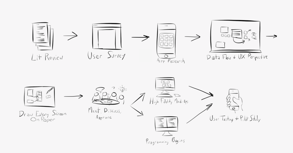
Literature Review + User Surveys
While reading through a literature review prepared by my collaborators, Dr. Sarah Schnitker and Dr. Benjamin Houltberg, I prepared a simple survey to be sent out to students in schools who had expressed interest in participating in the research study. While immersing myself in the positive psychology research literature, looking for aspects of interventions we could translate into games, I wanted to start filling in some demographic data on our high school teen users.
Some kinds of interventions were already on the minds of our researchers so we went ahead and added them with a 1-5 scale from least to most interested to see if any experiences would show up as intriguing.
App Research
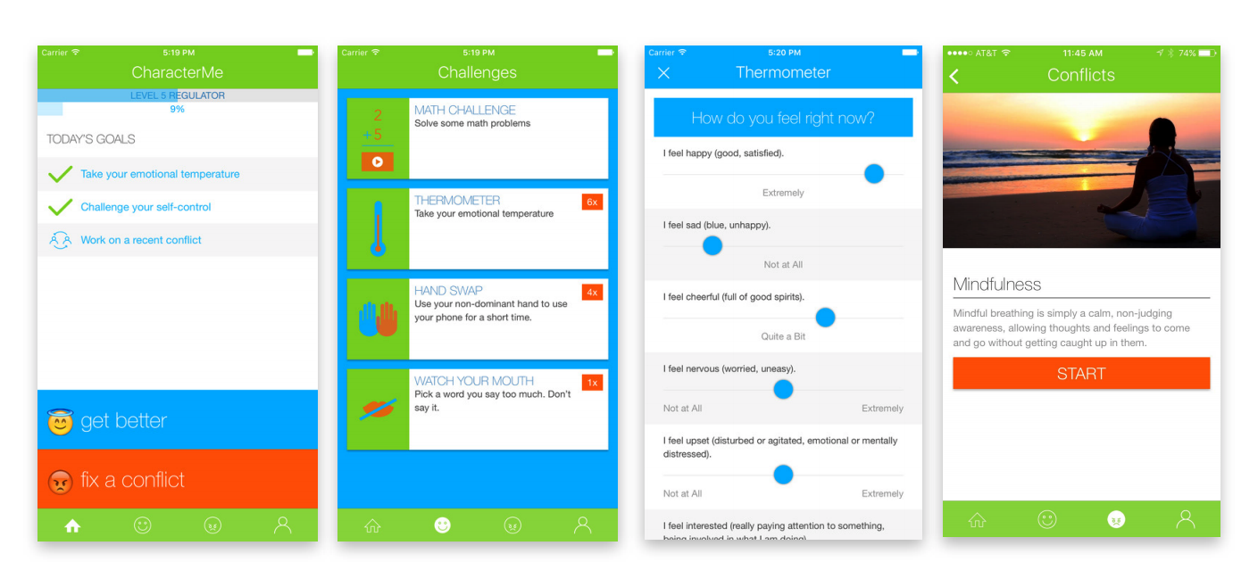
One of the critical pieces of data from the user survey was the list of apps they were already using on a daily basis. We wanted the interface to immediately feel familiar and intuitive. By starting with clear examples of apps they already live in, we avoided any unnecessary novelty that might impede easy use.
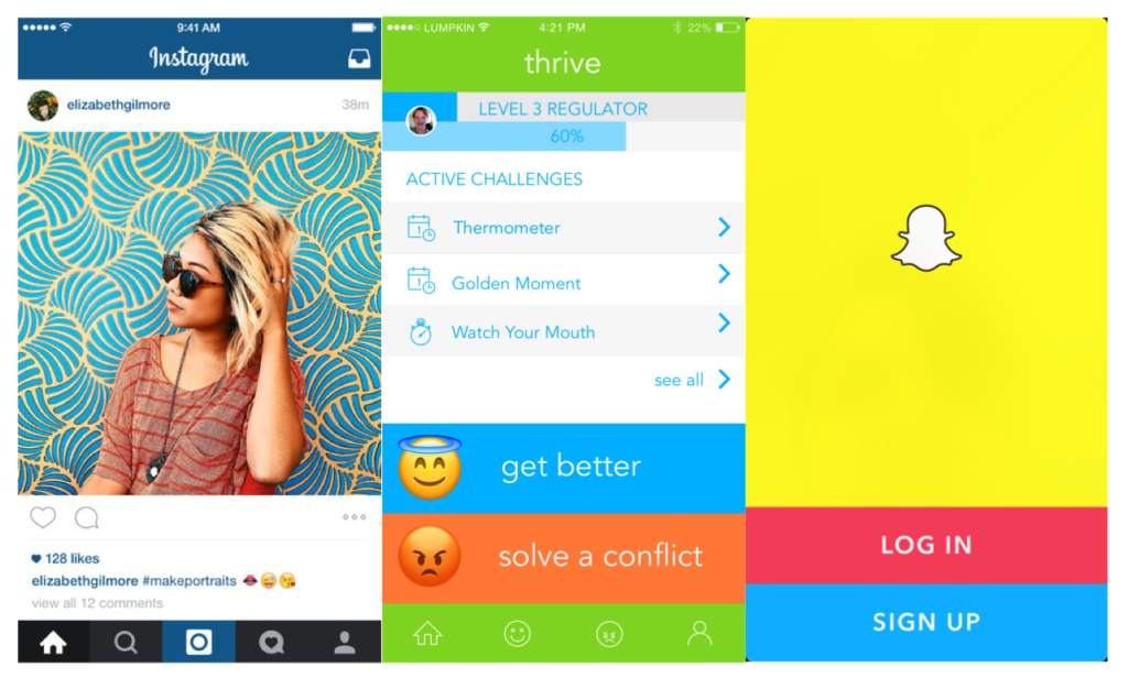
We borrowed the simple, bottom nav from Instagram and the bright, playful colors of Snapchat along with its whole-screen swiping gesture as a secondary navigation.
One aspect we did not borrow was the deliberate use of social reward to create addictive patterns in our users.
By now it has been widely reported that a small group of behavioral scientists at Stanford have had an outsized influence on the development of some of the most used most addictive apps. By applying insights from neureo and social science they have mapped a kind of set of “best practices” for creating addictive experiences. We resolved early not to follow these dark patterns in our design. We were aiming to create experiences that were intrinsically valuable and rewarding without using manipulation to do it.
User Interviews
Armed with this preliminary work we had some clarifying ideas of which games and interactions we thought were promising. We took that list and started visiting schools. The research team had already cultivated positive relationships with some teachers at a variety of local public and private high schools so we started visiting technology classes and lunch hours –really anytime the teachers could invite kids to their class and give me the floor.
I began by asking them to open their phones and go the settings screens that showed what version of iOS or Android they were running. I then walked around snapping photos to share with our developer. Next, I described the app’s goals generally and started asking for a show of hands on which features seemed interesting. As people responded I began to engage them one on one to talk more about why that feature or game sounded interesting.
The Importance of Language
One feature I was particularly interested in was one that came from the scrolling card view. I imagined a stack of conflict resolution strategies that any of these kids could pull out and use to help figure out better ways of resolving persistent conflicts.
“How many of you get into conflicts regularly? Show of hands.”
*crickets*
“No one? No one has conflict with their parents? Teachers? Friends?
A few girls shyly put up their hands.
“I can’t believe this. You guys must be some of the most peace-loving teenagers ever.”
“Do you mean, fights?” One young man asked.
“Yes fights. How many of you get into fights?”
*smiles* *all hands go up*
“How many of you would be interested in an app that had a stack of cards, each with a new strategy to try to solve a conflict?”
The room erupted with interest and narratives about the persistent recurring conflicts they have with parents, teachers, friends and significant others, often stemming from misunderstanding. This feature which had been an afterthought to the rest of the interventions was the aspect they were most interested in trying.
This is an excellent example of the power of user-interviews and the importance of paying attention to hints and clues in the responses of real people who are users or represent their interests.
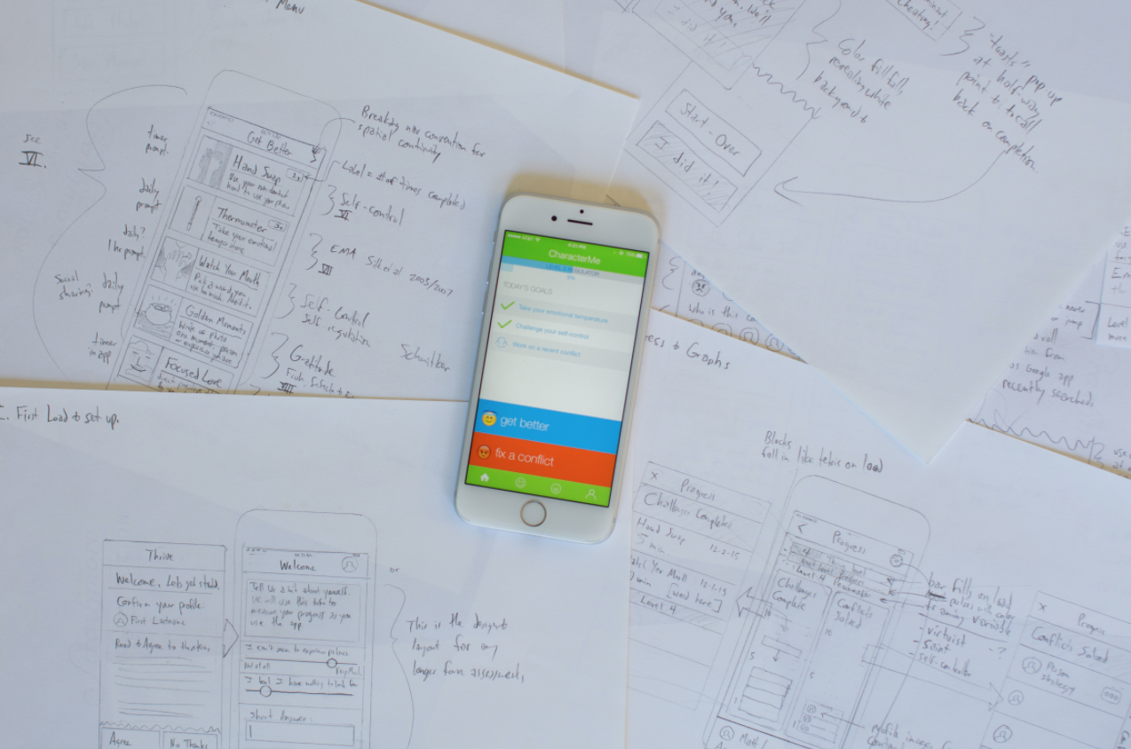
Pencil and Paper
I like to begin the mock-up process with pencil and paper at 1:1 scale. I prefer detailed and accurate text in mock-ups as the process of thinking through text and labels often reveals issues and problems in information architecture.
Meet, Discuss, Approve
The pen and paper mock-ups allow the key stakeholders to have something visual and narrative to respond to. It helps to build the mental model of the app in the minds of the team and surface assumptions *before* a pixel or line of code have been committed. This level of detail is also what enabled my developer partner to begin laying the groundwork for the app.
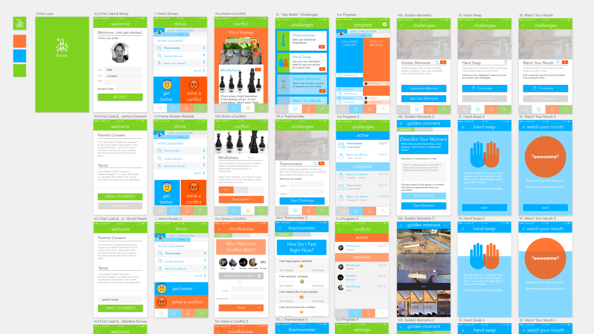
High Fidelity Mock-Ups
I prefer the vector drawing tool, Sketch, for high fidelity mock-ups. Once I had completed each screen and some keyframes for animations I could then share the sketch file with my developer sharing actual colors, typography, CSS and layouts down to the pixel.
Programming Begins
The pencil and paper mock ups enabled development to begin simultaneously to the high fidelity mock-ups. We kept in regular contact as questions emerged and shared visuals back and forth which enabled me to confirm that the details and atmosphere of my design vision were coming through in the finished product. Because of our use of a hybrid native and web architecture, I was able to load views of the app in the browser during development, long before we were able to compile the app into iOS or Android.
A Word on Naming
Up until this point we had used the working title “Thrive App.” But as we prepared to deploy to the app stores we needed a title with a cleaner search and some brand identity distinct from the organization overseeing its development. Before presenting the question to our stakeholders I did some quick and dirty user research by listing our top five name choices in a direct message on instagram to a small group of teens in our target audience.
The response was near-unanimous: CharacterMe was their favorite. It also happened to have the least overlap with any search on google search, iOS and Android app stores.
I’m a big believer in some research being better than none. And the research you can execute in the time-frame you need to help validate a decision with the target audience is more valuable than a more rigorous or higher sample size that comes after you need it. Jake Knapp in his book outlining Google Ventures’ user testing process agrees and underlines the diminishing returns on insights once you go beyond five user testers.
User Testing, Pilot Study
We knew that the iOS app store had a reputation for rejecting apps with little notice and feedback, we targeted the iOS app for deployment first. To our great surprise our app was approved on the first attempt after one week.
Next we deployed to the Google Play store. Once the two apps were available for download we went ahead with a pilot study with one school as a beta test to discover any remaining bugs and to work out the onboarding process.

Research Phase
Study Groups + User Interviews
Over the course of two years the research team conducted study groups at a wide variety of schools in southern California representing a mix of public, private and socio-economic status. Each study consisted of two weeks of daily use prompted by the app.
After each study concluded I met with as many of the students in person, as a group, on-site at their schools to interview them about their experience.
In general, they found the app intuitive and helpful. 70% of students polled said they would continue using it after the study concluded and that they would recommend it to friends. They listed the prompt to consider and record their emotional states and the conflict resolution strategies to be the most valuable activities in the app. The timer based activities were among the least favored.
Future of the Project
Presentations & Publications
My collaborators, Drs. Sarah Schnitker and Benjamin Houltberg continue to analyze the data captured in the research phase. We hope to publish the findings of the research study, as co-authors, later next year.
Further Development
Since beginning the project we have been invited by two separate funding bodies to write proposals for further development of CharacterMe for a public audience. Since the future of the app is less about research and more about the technology development and design, I took the role of primary on one of the grant proposals, wrote the project plan, budget and full narrative of the proposal.
The Thrive Center is currently hearing proposals for funding partnerships.
This project at the intersection of social science research and building technology that aims to help us be more human is exactly where my professional interests lie.
Building with the tools of technology enable us to deliver and test all kinds of new interventions that might prove beneficial to all sorts of people. The tools of social science add scientific rigor to test and assess whether what we’ve built is actually doing what we hope or having another outcome. The power of this iterative process toward building new knowledge and new experiences has only just begun to remake our world. With a bit more rigor and attention, we can steer that remaking in ways that support and reinforce our best human impulses.